Information on COVID-19 spreads at a pace that seems as rapid as the virus itself.
Trying to find the services you need and where and when they are available is akin to striking a moving target.
Want to know the latest infection rates and whether the virus is spreading or declining in your county? Wading through state sites can cause sensory overload. What, then, to do?

Enter Dr. Tom Felke, FGCU associate professor of social work, who has the expertise and patience to cure this dilemma by plowing through all the disparate sites and organizing the data into something that’s easy to navigate, timely and accurate.
“I saw the state Department of Health dashboard and realized it’s for the entire state of Florida,” he said. “For the novice who’s not familiar with how it works, it’s hard to find data for where you are. Most people are interested in their own backyard. I thought we could develop our own version using the same data but target it more to Southwest Florida.”
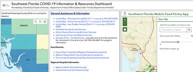
And so he did. The result: The Southwest Florida COVID-19 Information & Resources Dashboard. It uses up-to-date information from the Florida Department of Health in an easy-to-navigate format so users can pick a county and find out such things as the following:
- A COVID-19 map, updated twice a day, supplied by the Florida Department of Health, includes the total cases, deaths and hospitalizations, number of cases by age, gender, race and ethnicity and how many people have been tested and the results.
- The same column also provides access to general information from the Florida Department of Health, daily updates from the Centers for Disease Control and forecasting by the Institute for Health Metrics and Evaluation, an independent global health research center at the University of Washington.
- The second column offers information and resources on agencies such as United Way, county human services and Salvation Army, area food pantries, regional hospitals, support services for older adults and mental and behavioral health services.
- The third column is an interactive map that shows mobile food pantries in the region, divided into those that are specifically for children 18 and younger and those for all ages. It is searchable by ZIP code or address.
“We’re not trying to reinvent the wheel,” Felke said. “We’re trying to work from what we know has been successful and visualize the data for people. We’re trying to put everything in one place so people can comprehend what’s going on when there is so much uncertainty right now.”
 To Casey Nobile (’14, Social Work, ’17, MSW), a medical social worker for Lee Memory Care, the dashboard has been a valuable tool as she attempts to help people find the services and products they need.
“I primarily work with seniors and most of my client base was isolating at home, so it was challenging for them to go shopping and find food,” she said.
Nobile was busily calling food banks and other service agencies to find mobile food pantries to determine when and where they would be and match them to her clients. But it wasn’t easy.
“At times like these, when everyone’s stress is heightened and they are worried about their needs for food and shelter – and some aren’t working and can’t pay for food because of lack of income – having this resource that Dr. Felke has created available to see where they are supplying free food and where to find services makes a very stressful situation less stressful,” Nobile said.
“It’s like a one-stop shop for everything you could need to support you through this pandemic. I’ve been able to share it with my contacts in the health and social work fields so they can help support their clients to the best of their ability as well.”